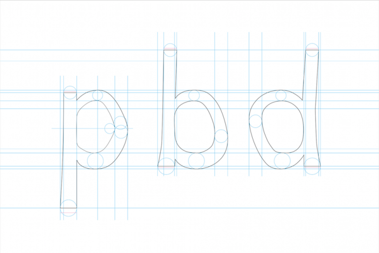
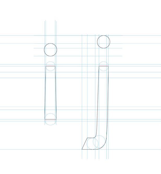
A new typeface is making life easier for people everywhere who live with dyslexia.
Christian Boer, 33, is a Dutch graphic designer who created the font that makes reading easier for people, like himself, who have dyslexia, according to his website. Now, he’s offering it to people for free.
*Sign up for The Mighty Newsletter*

The typeface is called “Dyslexie,” and Boer first developed it as a final thesis project when he was a student at the Utrecht Art Academy in the Netherlands. The font makes reading easier for people with dyslexia by varying the letter shapes more, making it harder to confuse similarly shaped letters like “b” and “d,” for example.

Dyslexia is a language-based processing disorder resulting in a learning disability often characterized by difficulties with accurate word recognition, decoding and spelling, according to the National Center for Learning Disabilities.
Research suggests that about 17 percent of the population has dyslexia, according to PBS.
Watch the video below to hear more about how “Dyslexie” works:
“Traditional fonts are designed solely from an aesthetic point of view, which means they often have characteristics that make characters difficult to recognize for people with dyslexia,” his website reads. “Oftentimes, the letters of a word are confused, turned around or jumbled up because they look too similar.”
The font has been proven to get positive results, including a reduction in flipping and mirroring of letters and increased ease in reading for dyslexics. Independent studies at the University of Twente and Amsterdam found that nearly three-quarters of the students surveryed reported making fewer reading mistakes when taking a test written in the font, according to “Dyslexie’s” 2012 research.
To download “Dyslexie,” or for more information, visit this site.
Want to end the stigma around disability? Like us on Facebook.
And sign up for what we hope will be your favorite thing to read at night.

