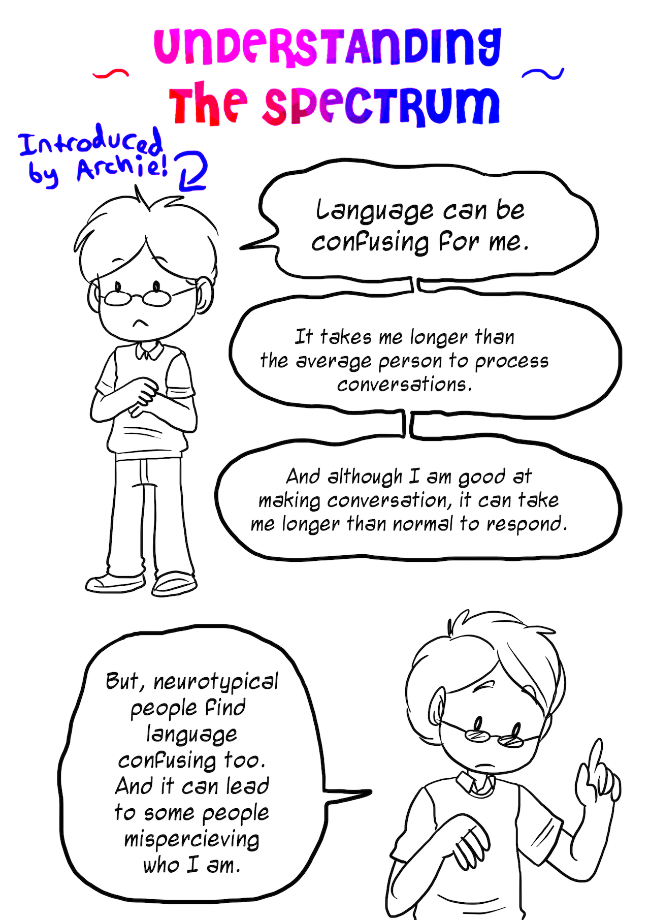
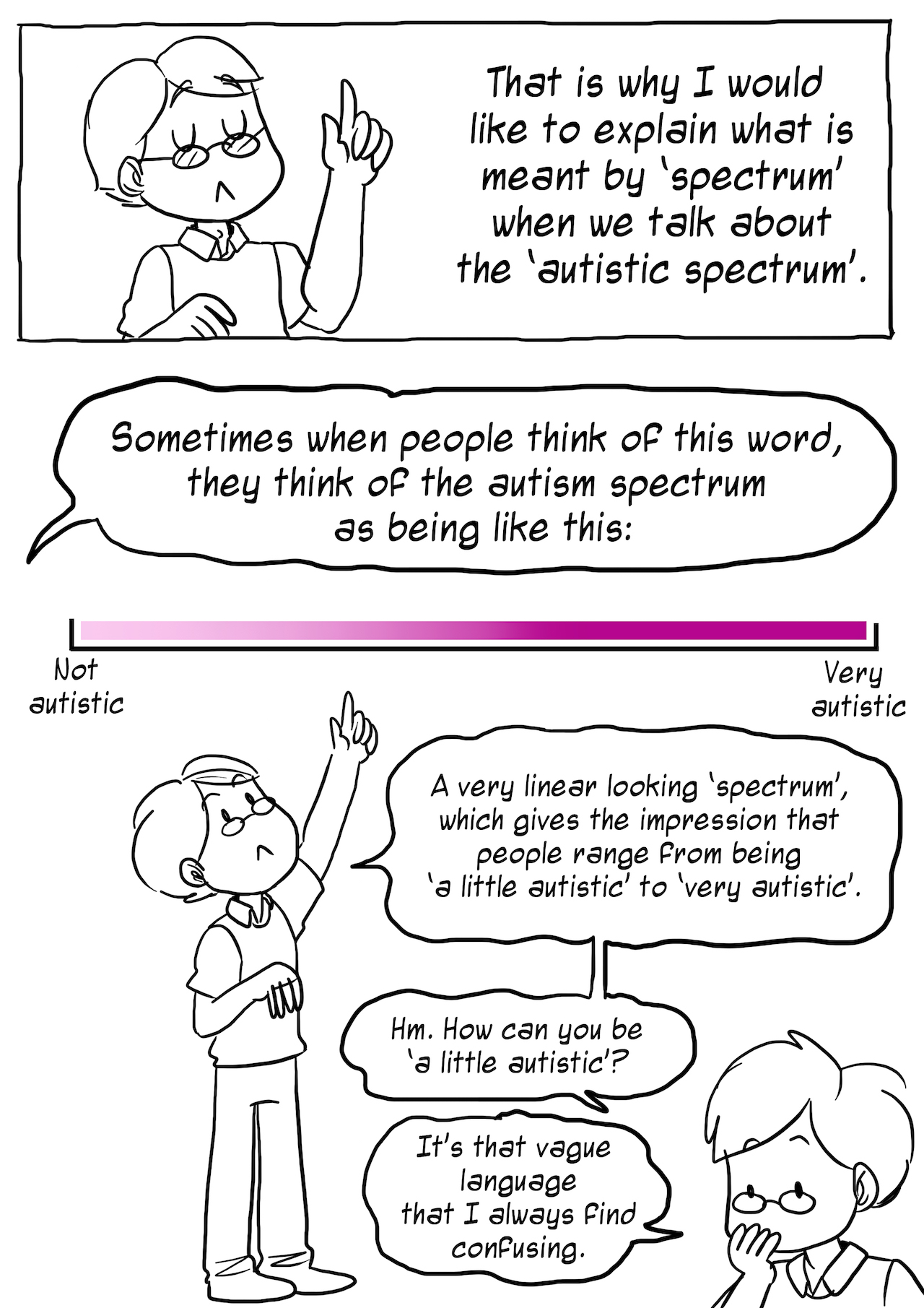
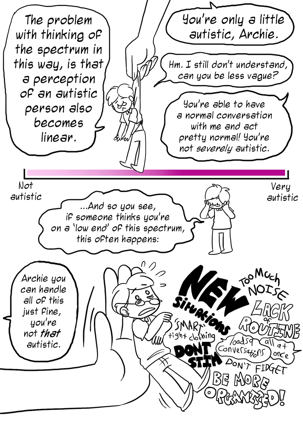
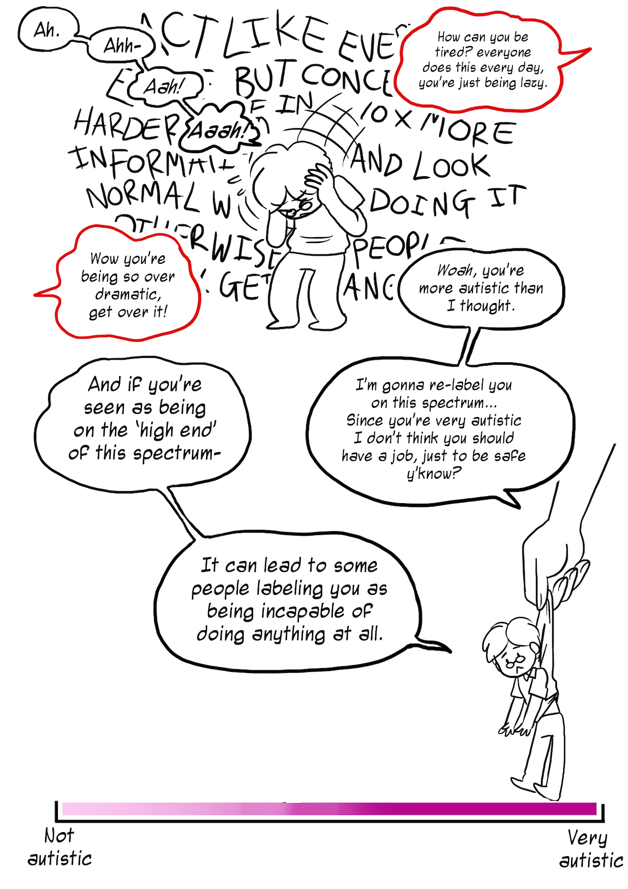
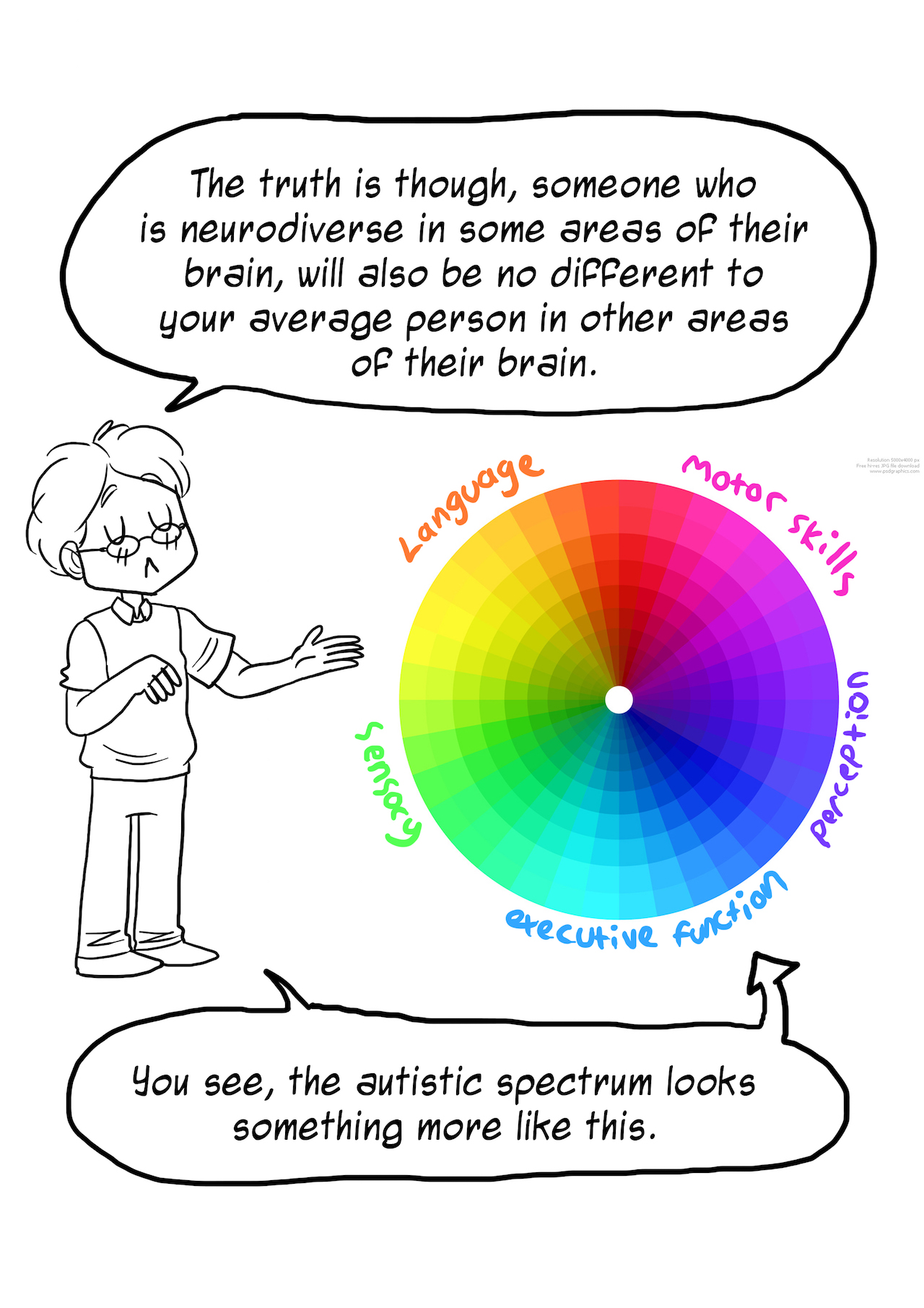
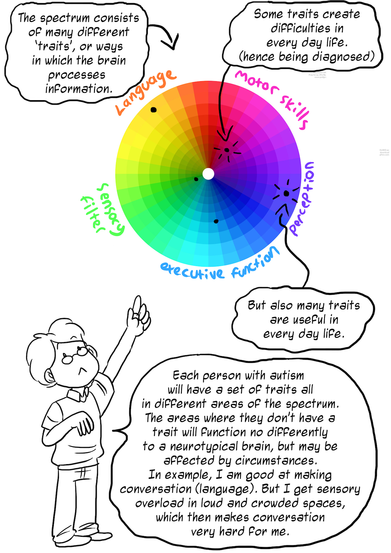
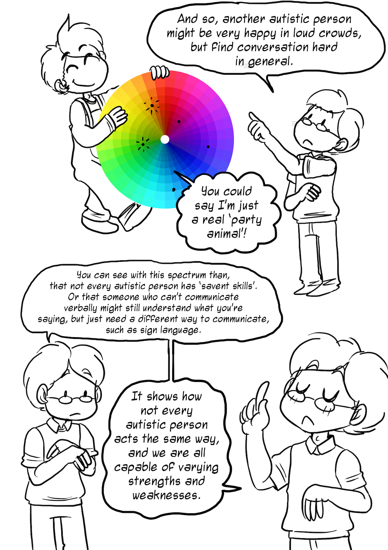
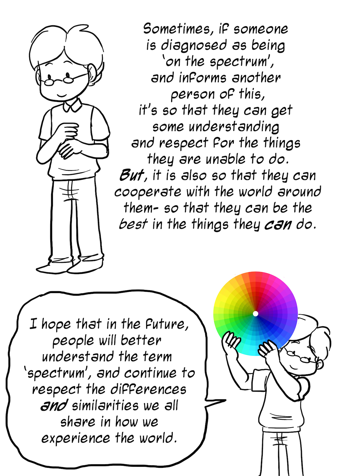
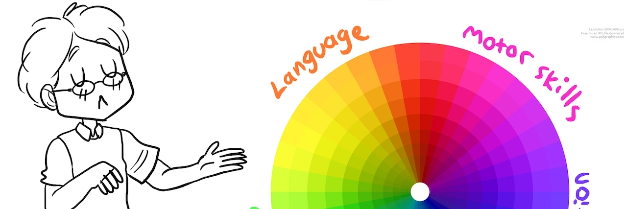
Rebecca Burgess sees a problem with the way many people perceive the autism spectrum. Her resolution? The comic below. The Tumblr user debuted “Understanding the Spectrum” (below), which gets rid of the linear autism spectrum image (i.e. you’re either “not autistic, “very autistic” or somewhere in between) and replaces it with a round spectrum full of several traits or ways the brain processes information.
“I want people to understand that autistic people don’t all fit a stereotype, and show people the consequences of stereotyping,” Burgess, from the U.K., told The Mighty in an email. “[Stereotyping leads to] underestimating the skills of autistic people or not believing someone [who is on the spectrum].”
The comic, which she released in April for Autism Acceptance Week, has earned her messages from autistic people, parents and teachers, thanking Burgess for helping them explain the spectrum in a more accurate way.
Take a look at “Understanding the Spectrum” below, and let us know how you would describe the spectrum to someone unfamiliar with autism in the comments at the bottom.
